Open Studio: Work in Progress for ArtExpoNYC 2016
We are three weeks away from ArtExpoNYC at Pier 94. I’ve been painting every minute of my weekends in preparation. Here is a look into my process and a typical day in the studio at Garrott Decor leading up to the show.
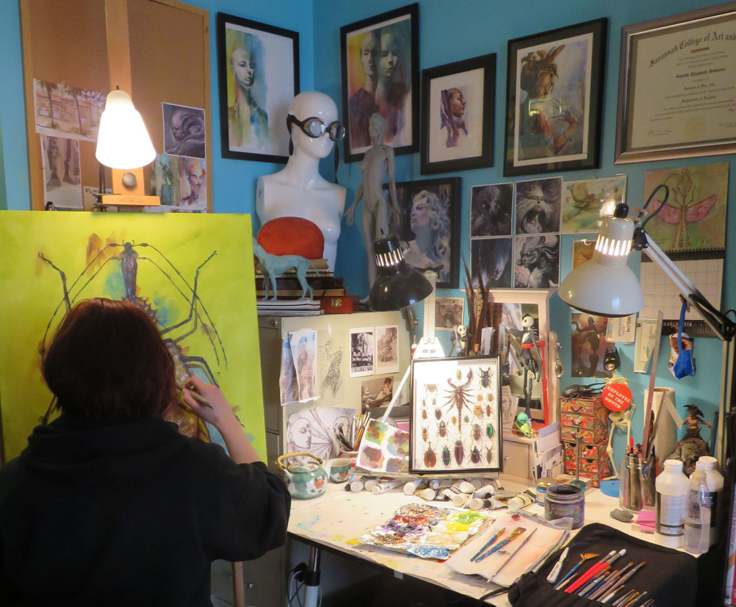
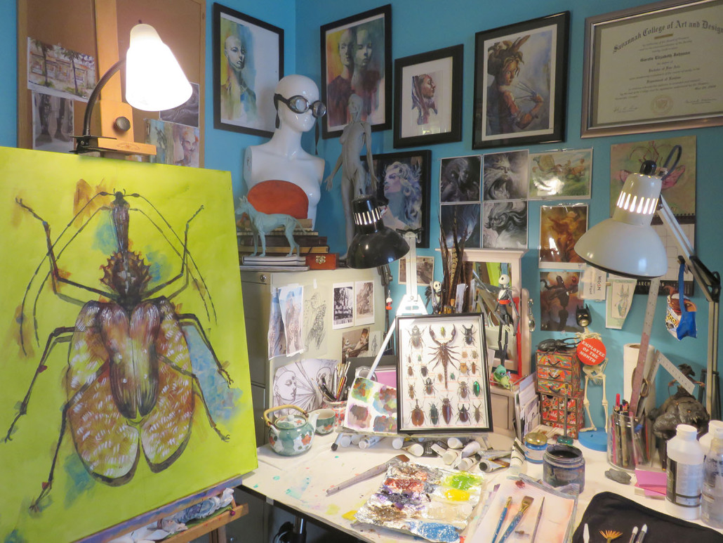
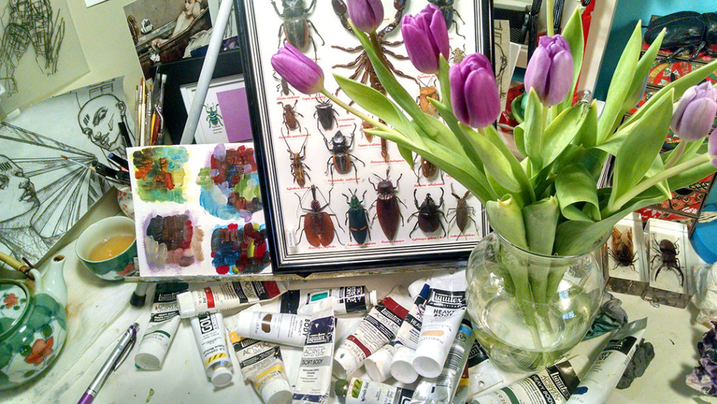
You can see I surround myself with plenty of inspiration and reference material. This can be anything from prints of my favorite artists, concepts I’m working on, action figures from favorite movies, things that make me laugh and of course, color! I’m all about tidy spaces but the studio is another animal all together. This space is meant to get me working, so everything I’m thinking about is out in front of me. As you can see, I have a lot on my mind.
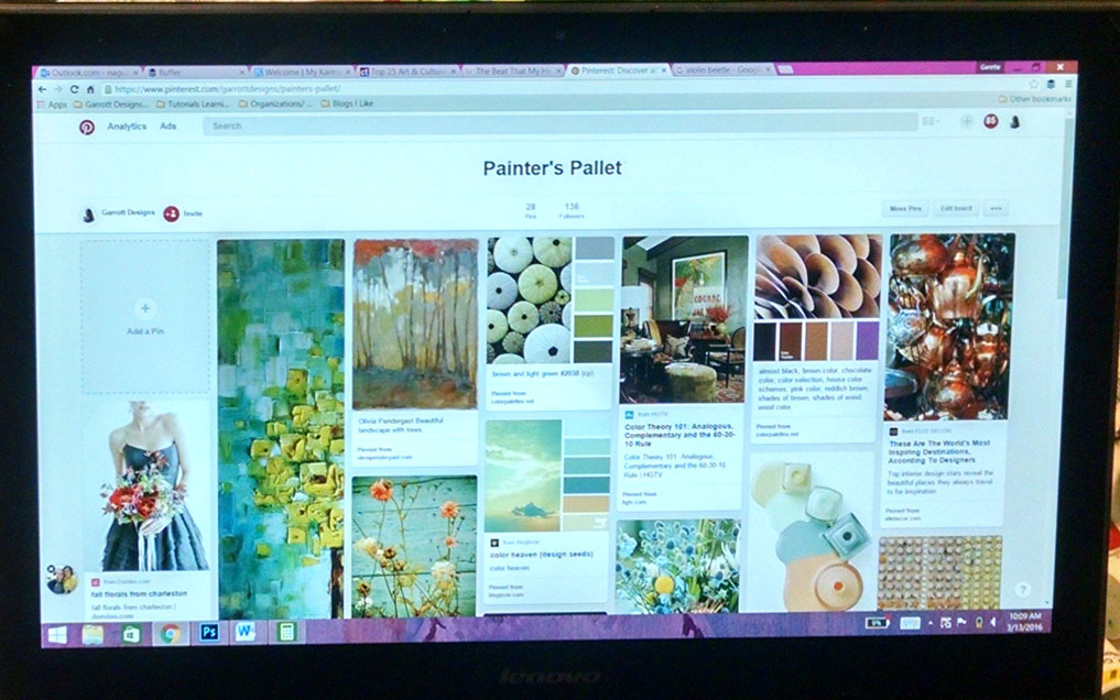
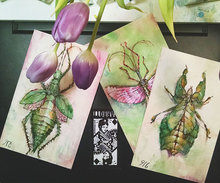
With my series “Natural Selection“, color and playfulness is at the fore of why I’m painting these amazing creatures. I use my Pinterest board “Painter’s Pallet” to curate images that have color stories I’d like to use in future paintings. You can see here I’ve made a thumbnail of 4 pallets based on images from my board. I’ll keep this little splash around for the next few bugs.
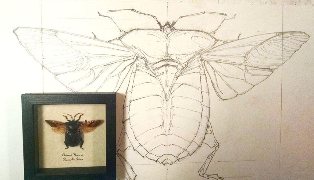
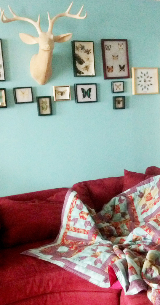
Since I collect specimens from around the world, I have plenty of insects to choose from. This “Red Heart Beetle” is so cute, I’d love to see it as purple as my bathroom is. Here is my sketch on Bristol board with the framed friend who usually hangs in the living room above my couch.
Once I’ve enlarged the sketch and transferred it to a stretched and framed canvas, I lay down my under painting and get moving. Ultimately the background will be a dusty purple while the Phthalo Green you see now will serve as a “bounce” color in the shadows. I call it a bounce color because you don’t really know it’s there unless you pay attention to it. The color is seen but you’d not call it out if someone asked you “What color was that painting?”
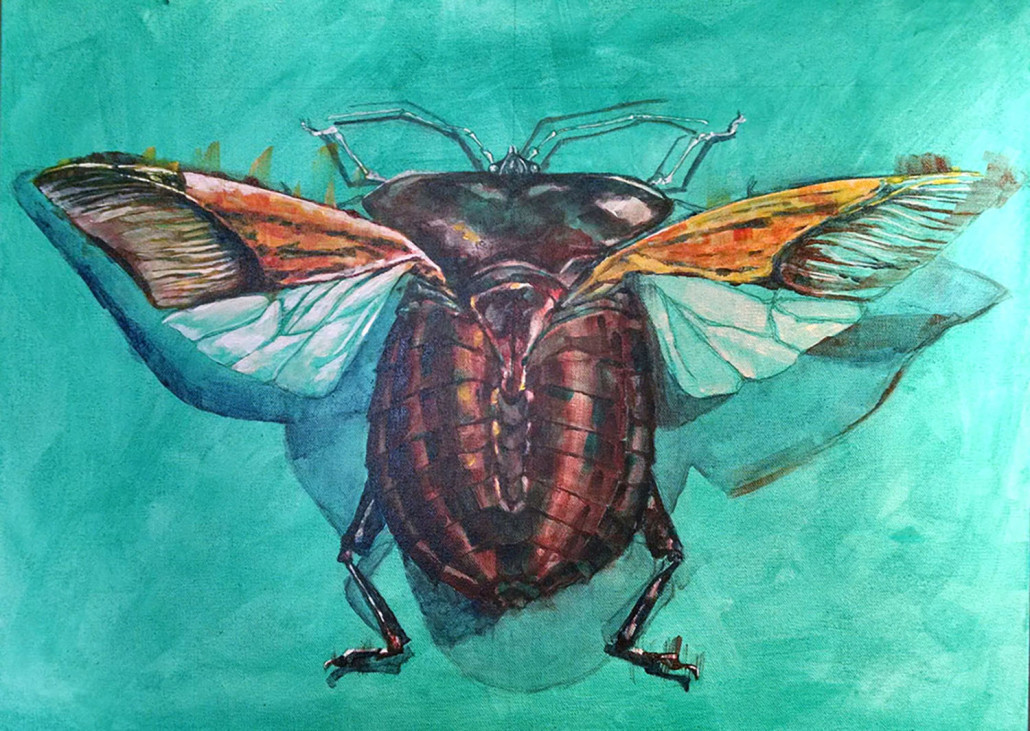
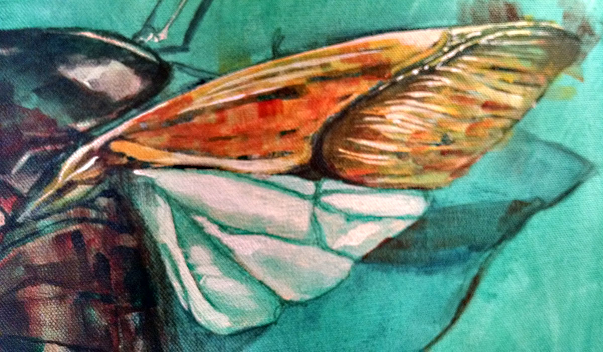
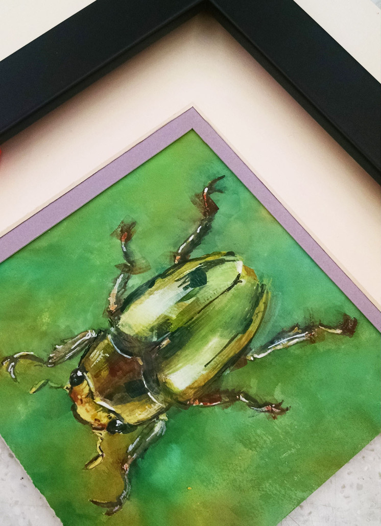
What is so great about a “bounce” color in whatever strength it exists, you can choose it as your matte color when you frame the painting, It brings the piece alive and pops rather musically on the wall with this unexpected color arrangement. See the image below, The purple is hardly in the painting but it’s sings wonderfully with it anyway. (Can you tell I love purple?)
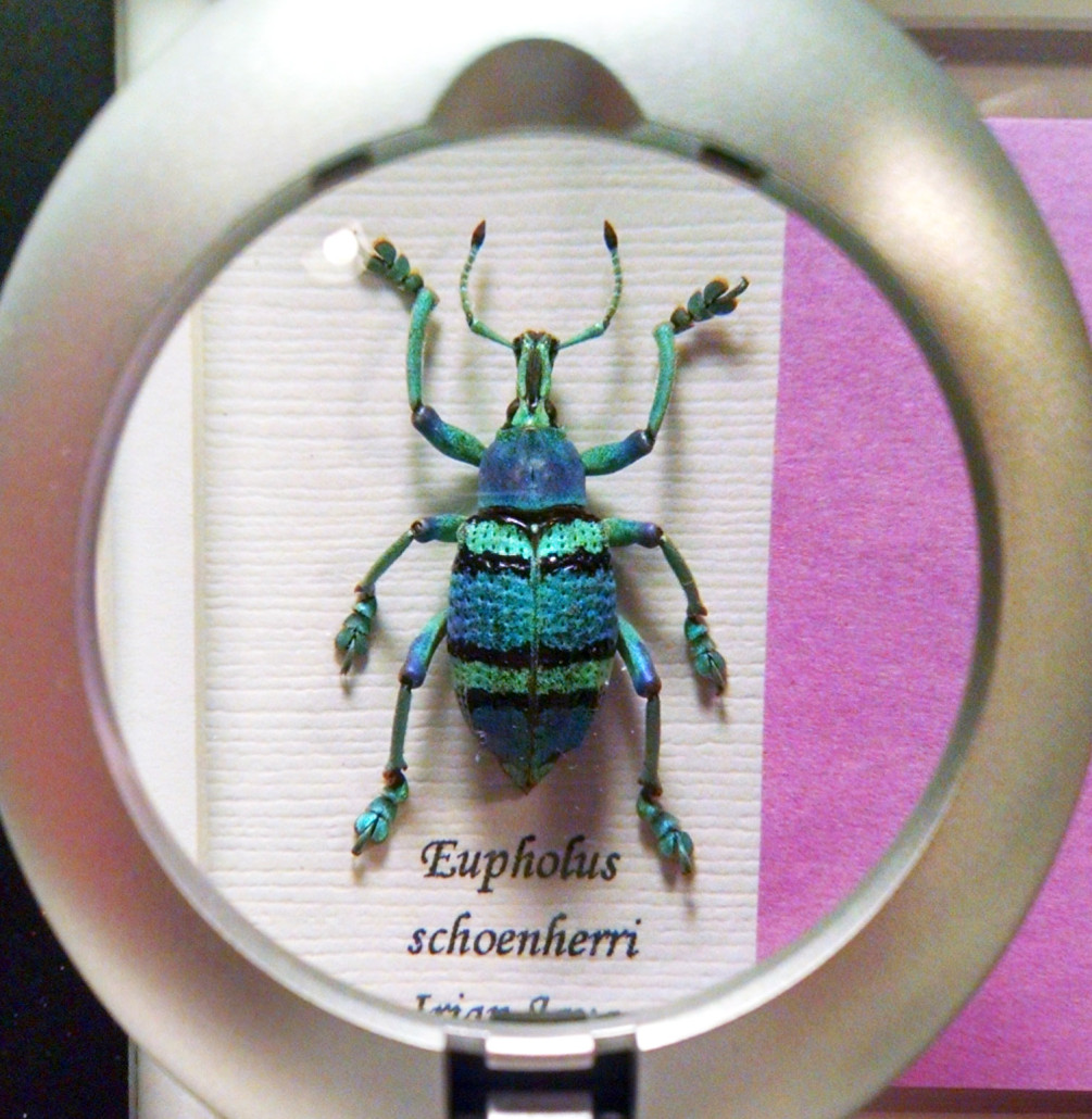
Can you spot the “bounce” color in the below “Greater of Blue Weevils” painting in progress?
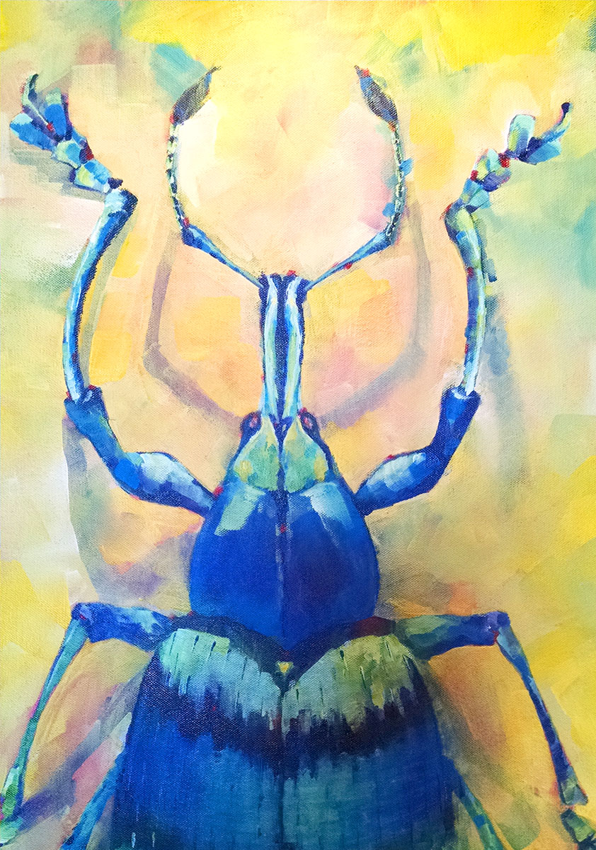
You guessed it, Napthol Crimson. Imagine what this painting will look like in a room dotted with red?
Purple doesn’t look so bad next to it either ;)
