I’ve been pretty fascinated with the work of David Grove and Bernie Fuchs for quite some time now. Back in art school I coveted my issue of “Illustration #15” flipping through it’s vibrant pages, noting how Fuchs captured the luminosity and transparency I strove for. The exulting quality of that warm glow, apparently, was inspired by “the amber color of a mug of ale with sunshine streaming through it”. Fuchs experimented with acrylics first and mastered the effect with oil, Grove mastered this effect with the use of watercolor and acrylics combined.
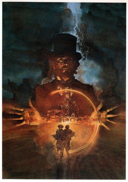
"Something Wicked This Way Comes" David Grove
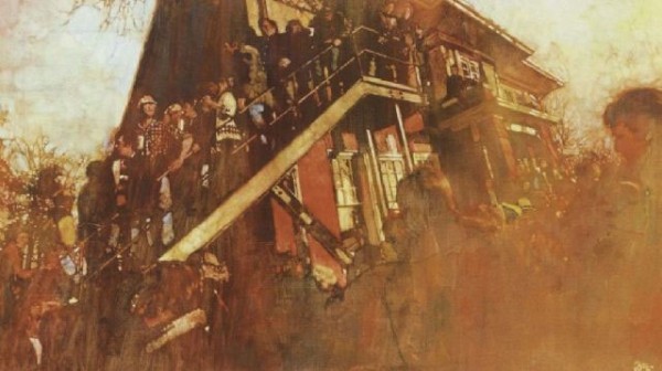
Bernie Fuchs
I’ve been experimenting with both watercolor and acrylic techniques in effort to become more expressive with a language of transparency my current uber detailed “glazing” technique accomplishes. (See example of that here.)
In preparation for an up coming show in Chelsea, New York I see no better time to commit myself to a group of “large” paintings exploring this desire. So let me share with you one of the results…
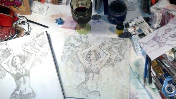
I began by choosing sketches and photo reference from a life drawing session at Dr. Sketchy’s Asbury Park featuring the lovely Felicia Fatal. I then transferred the doodle from my sketchbook to a panel of Gessod door skin. You can see a former “abandoned” drawing under the gesso as well as tea stains from my dripping pot of tea. I like to mark up a thing real good and allow those “happenings” to show through a completed work. Why? I couldn’t tell you except that it just IS the way I is.

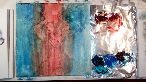
Paint throwing time! I start with a transparent wash of “Cerulean Blue” and “Quinacridone Burnt Orange” (love me some “qunis” yo) these pigments are mixed generously with Liquitex matte medium to give them the viscosity I need.
Yes, that is aluminum foil I am using as a pallet. Yes, I can afford a “real” pallet however, the beauty of this biodegradable and disposable wonder is that I can spray my color globs with water, fold it up all nice an neat and put it in the fridge, there by preserving my paint for at LEAST a week. Yeah, I know, it’s genius.
Next I use gesso mixed with matte medium and water to establish my first pass of mid values that will later be glazed.
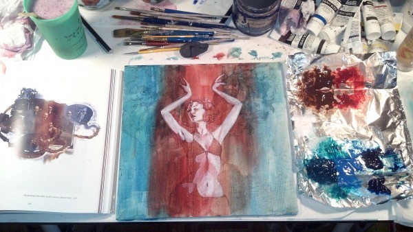
You can see my reference book “David Grove- An Illustrated Life” open next to the painting. I know, I know, “you’re only as genius as your reference is obscure”. Remember folks, You only get better if you look at the good stuff. Whoever expects you to create in a bubble is trying to kill you. ;)
I start glazing in the “local color” on top of my established lights and turning form by changing values from warm to cool as they recede into shadow. Granted this is a more “graphic” style of doing so, I am in no way attempting a Rembrandt here, but using a graphic form of rendering shadow often used in sequential art.
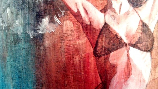
See here in the detail; all the texture the wood panel and unsanded gesso gives, as well as the glazing treatment at work in the bikini top and underarm shadows.
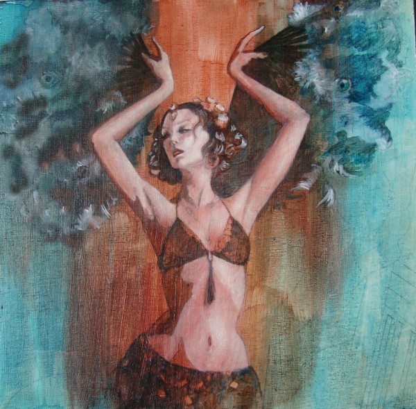
Glazing in progress: pushing back shadows and pulling out the lights is always a process. Trying not to over work it and keep it loose. “Get in and get out” as they say…
At this point I sought the help of some friends who took the time to give me some Photoshop thumbnails and suggestions. Thank you, thank you, my wonderful pals. It’s always nice to have feed back both from artists and art appreciators to help you figure out if you’ve said what you came to say.

