Designing Creative Space: Case the Work Place
I recently attended a MeetUp Group event put on by The Design Gym and hosted by Steelcase . The question posed at the door was, “What was your favorite place to do (home) work as a child?” As we sipped drinks and noshed appetizers, little groups of strangers shared candid conversations about their favorite places.
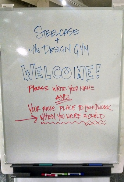
A musician from Chicago said he enjoyed working in the bathtub, he would place a board across the sides and sit against the back. A woman said she liked crawling under the grand piano. Another person liked to climb a special tree in the yard. My own brother (the architect) liked to press his back and legs against a doorway and inch his way to the top to read a book. When we were kids, we’d build forts everywhere in the house and outside. My mother couldn’t afford to get me a cool bed tent (you know, in the 80’s) so I built myself one, this is what I called out as my favorite work place. (I’d tell you details about it’s brilliant construction but that’s not what this post is about.)
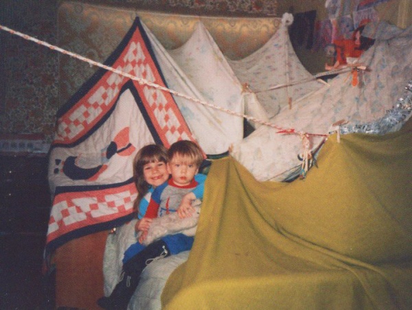
Just about everyone in that room was in a creative profession and they all preferred an unconventional space that provided solitude and comfort as a child. A trending term for this kind of space is “Cocooning“. The next question was, “If you could work in a nontraditional space in your current job, would you, and what would it look like?”
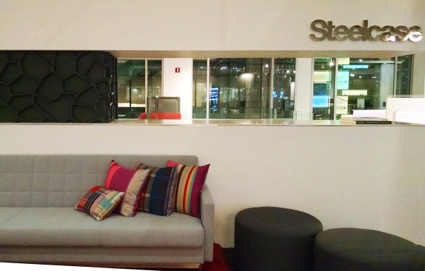
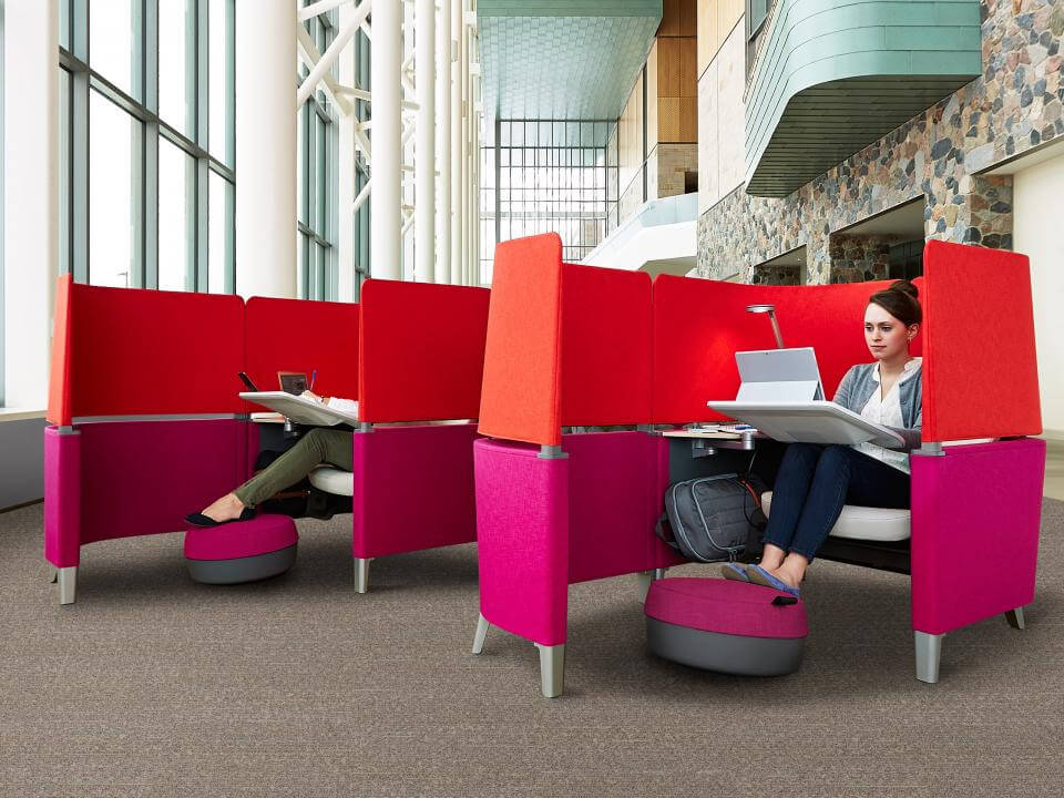
If you are familiar with Steelcase, you’ll have seen the Brody Work Lounge that cocoons the body and mind into productive contemplation.
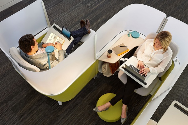

The Brody designs are like little forts in public spaces where people can relax and focus. Is it any coincidence new trends are emerging in public and corporate office spaces all over the world? Digging further into our conversation with The Design Gym and Steelcase we discovered that people also preferred a variety of different types of spaces for different work functions. Such as a space for interacting with technology vs. analog creativity with pen, paper or dimensional materials. The below photo was taken in the commons area at WeWork Bryant Park location. They provide a variety of places and spaces for their members to collaborate or work in solitude.
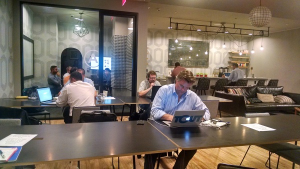
Meeting spaces are often not very conducive to group discussions. If you’ve read Ed Catmull’s book “Creativity Inc.” he tells of the Pixar Steve Jobs designed meeting room where the table was too long and excluded half the meeting members creating an uncomfortable hierarchy that Ed had to work to dispel. It was stressful for him to work in that way and probably frustrating to any newbie who had a great idea that they were too far from anyone to bother to call out. Collaborative space deserves a redesign. In the past, hierarchy was something a corporation wished to communicate, but in creative fields, a design team is equal parts essential.

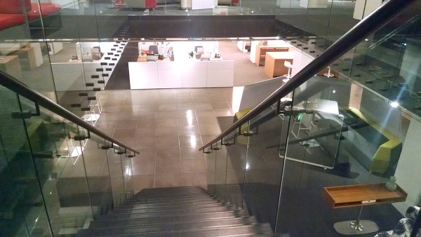
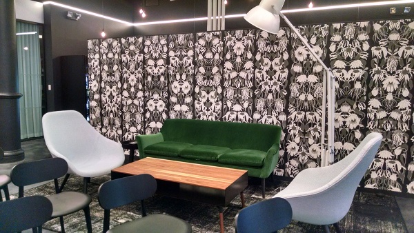
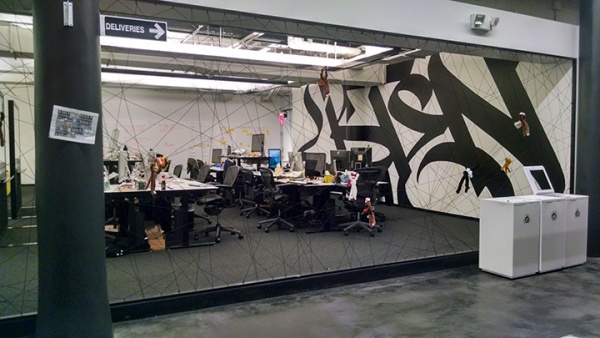
There are companies who are well aware of this need and have designed great spaces around the concept of variety, solitude, collaboration, comfort and creativity. I visit Spotify from time to time for Designers + Geeks lectures and NYC Web Performance presentations. Check out the variety of spaces available to employees.
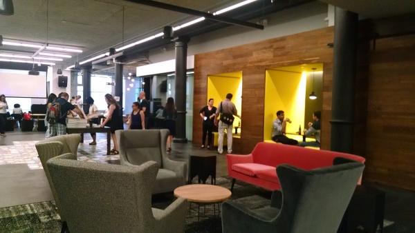
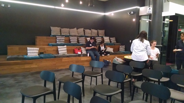
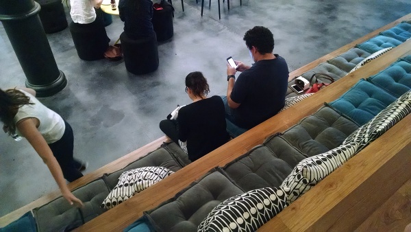
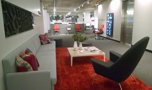
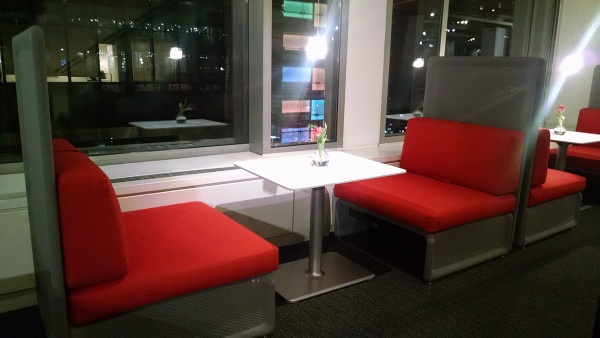
Steelcase’s own offices are just as interesting with a variety of spaces to explore. An open commons area make it inviting where no area seems off limits. You know how, approaching the corner office for the CEO use to feel? Not at Steelcase, that is not to say there aren’t luxurious spaces for important people, its only to say that everyone has a space to enjoy and choices about where they do what.
Thinking about my work space at home, I have three separate areas to work. I have an easel and drafting table for painting, a workshop table for draping and pattern making with three sewing machines. There is another drafting table area for fashion design and illustration. In addition to those analog spaces I have a computer desk separate from my work areas but near enough to listen to podcasts and music. I can use any of my mobile devices to create a comfort office near any of those places.
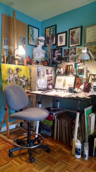
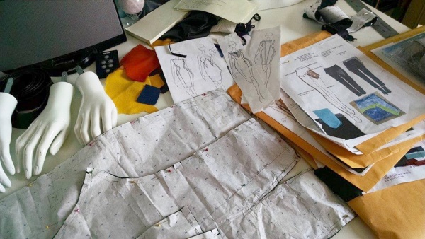
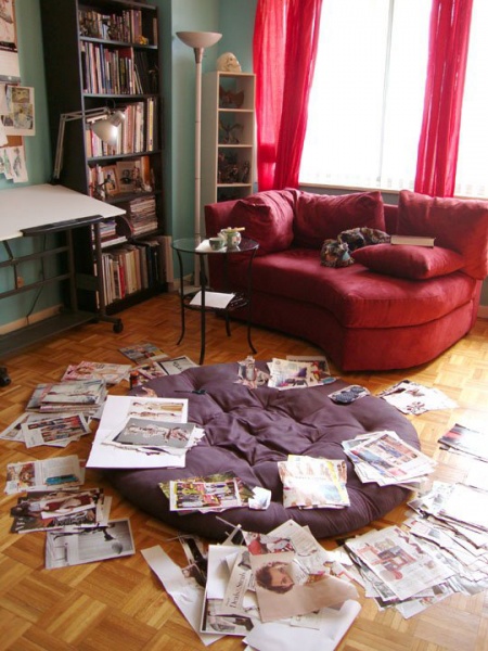
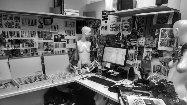
It is important for companies to rethink the office spaces and allow a more flexible working condition for employees. We spend more time at work than ever and in many cases our lives and work overlap. How many times do you stop at the office after hours or on weekends? Do you bring work home? Personal space is essential and must be customized to inspire. See below my workplace at the office. It’s a sort of visual cocoon for me where I contemplate the next seasons trends and create reports to prove my hunches. If I had to work in a white walled sanitarium, I would truly go nuts. On the other hand, someone in production may prefer a minimalist “white space” where they can organize technical details and think through cost and production clearly without distraction. No two employees have the same needs, so standardizing the workplace will not be the future of office design.
The conversation at Steelcase with The Design Gym raised some interesting questions and thought provoking concepts about work place paradigms the future simply will not tolerate. When you’ve seen the difference, the insufficiency of cumbersome spaces becomes glaring. How would you change your working conditions? What does your ideal work space look like? Are there pain points in your office that cause creative friction? Share your ideas in the comments below.
