Design Thinking: Sketching to Solve Problems and Sell Ideas
The Design Thinking process of discovery started for me last spring when I was invited to participate in a co-creatorship to design a commercial home beverage product. At the co-creator Hackathon, a visual facilitator or graphic recorder quietly sketched out illustrations to key points in our ideation process. This helped us quickly form a presentation and flesh out a proposal. I was so fascinated by what he was doing that I had to learn more about it and eventually make it one of my own skill sets.
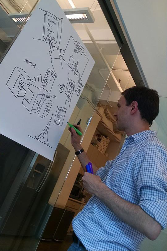
My continued desire to work in in this way, and curiosity for this type of recording and brain storming lead me to join “The Design Gym“. The Designs Gym runs a wide variety of classes and workshops on creativity, collaboration and innovation, and has grown a diverse community of people around these topics.
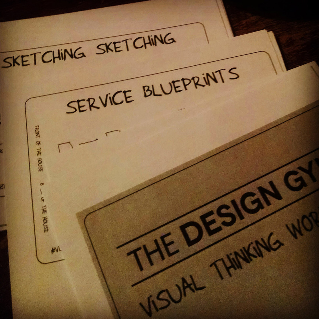
A few weeks ago I took The Design Gym’s Sketching Bootcamp after attending several meet-ups including one that introduced me to the instructor John Bloch and his process. It was a Saturday well spent. We covered basics in visual vocabulary, process mapping, frameworks, and summarizing data in the eight hours with a small group of twelve professionals over several exercises. After the class I sat down and figured out at least three areas of Ah-HA moments I had during this class. I’d say that’s a pretty productive session. Here is what happened and what I found:
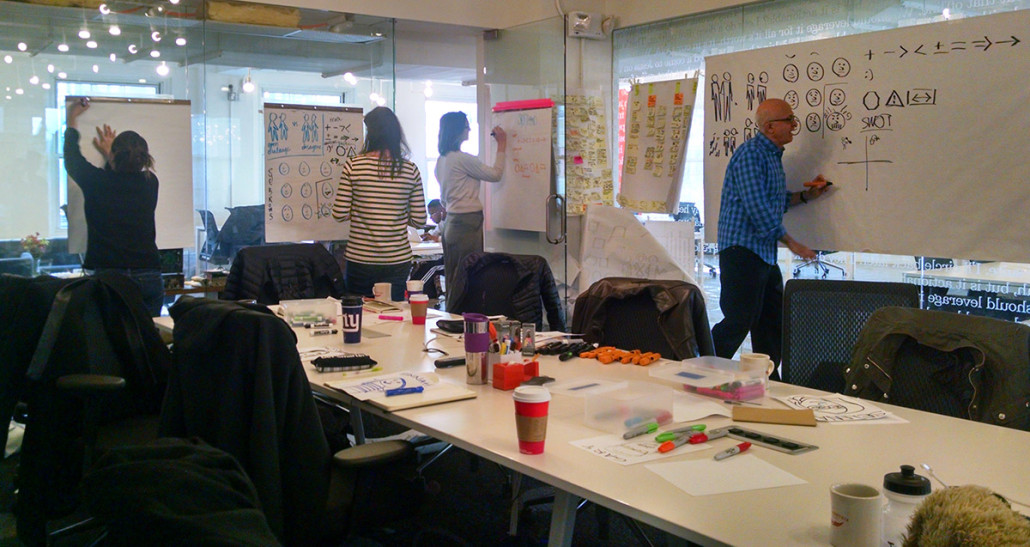
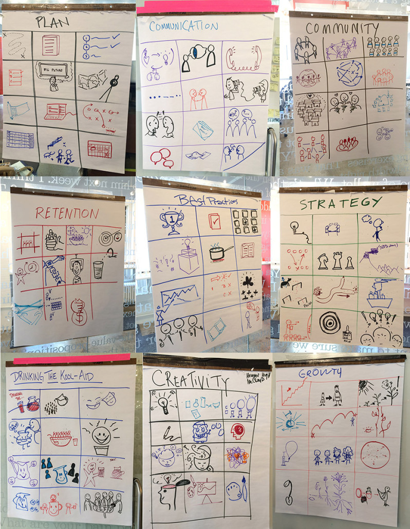
We started with basic visual vocabulary to illustrate abstract concepts such as communication, creativity, strategy etc. Coming from an illustrator’s background and training; I try to come up with less obvious visual solutions to tell stories. For this kind of work, the more obvious the illustrations are the better they work. You can see however, a few of these illustrations are both creative and easily communicate the concept. This was my first epiphany to learning this new skill set. Images are most successful when clever but instantly understood.
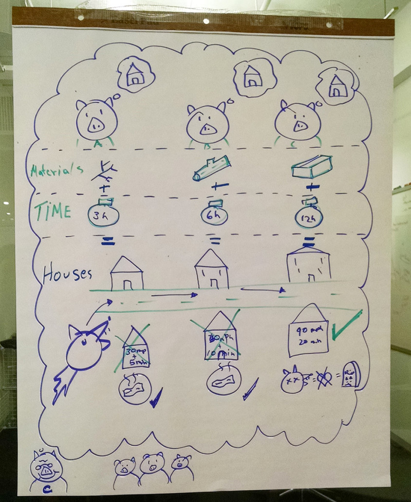
Next, we split into groups to tell a story emphasizing one of the following sets of information: qualitative, quantitative, position in time and place, or cause and effect. We were assigned a modified version of the Three Little Pigs. I illustrated each character and the design of their respective houses. Clearly, the illustrator in me loves the Who and What. I struggled on my own to illustrate the actions, timeline, as well as cause & effect. Once we paired into groups I saw how other people approached other aspects of the story. Together, we put together a most amusing and cohesive visual report. Working in groups can be more powerful than it’s individual parts if the right combinations of perspective exist. I learned, through their lens, to consider other angles of story telling and layout. 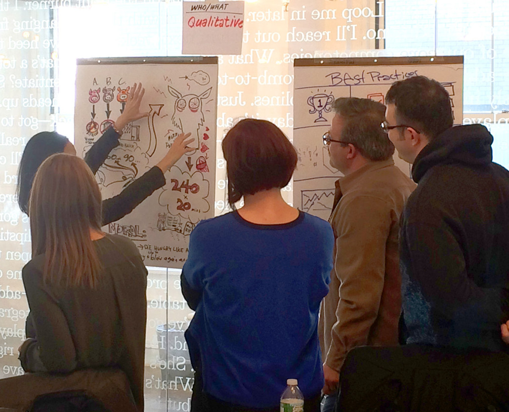
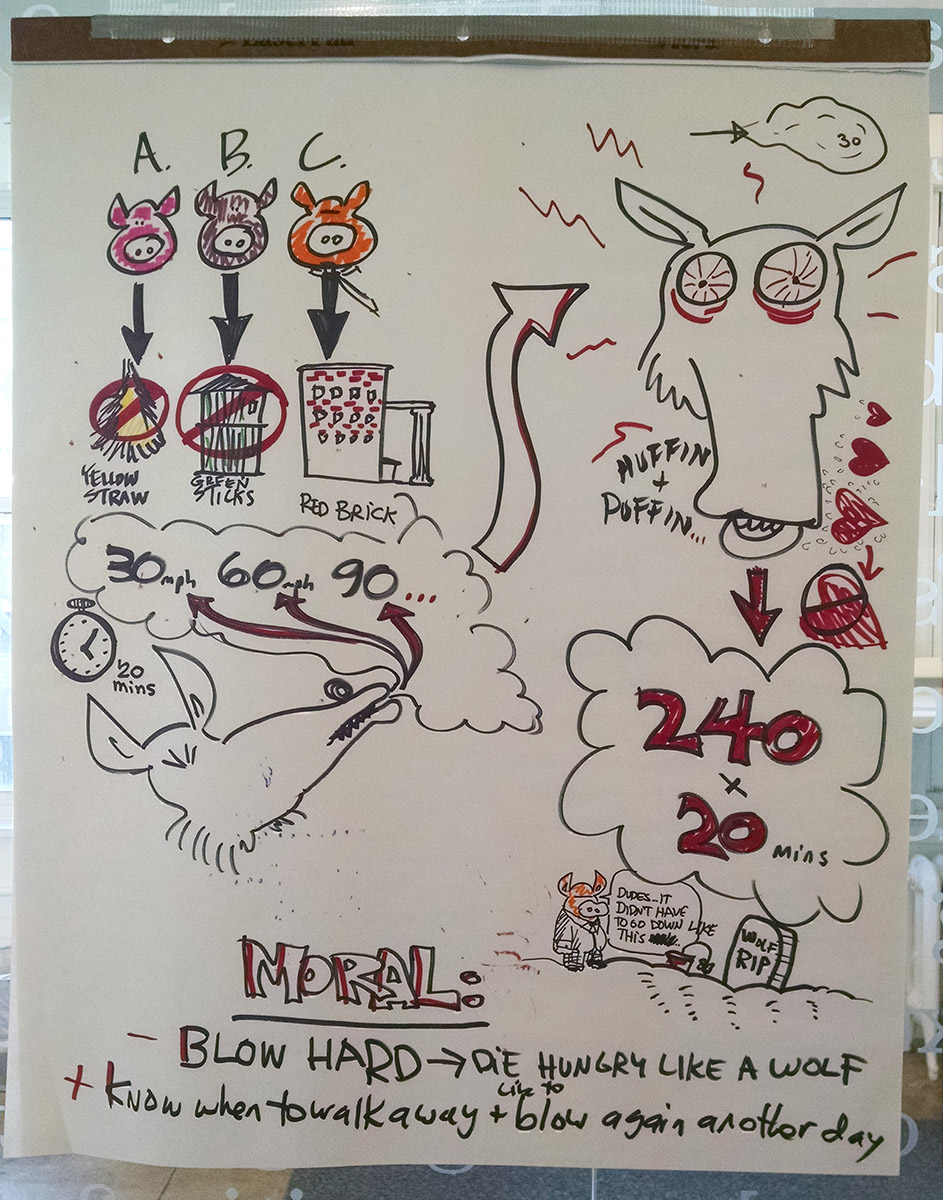
Other group’s solutions with cause and effect, position in time and qualitative were a new visual approach to me as well. The ‘infograph’ is an excellent way to deliver facts at a glance. I really liked the below solution, it looks like a Time magazine spot. I’d like to practice being more graphic and less arty. I have not intention of losing my artiness mind you, I’d just like to add it to my tool box of visual solutions.
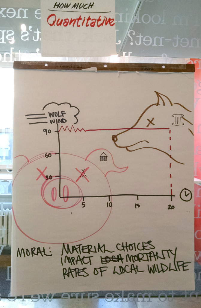
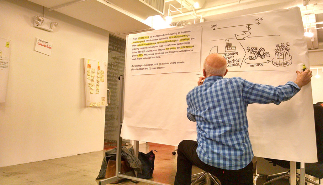
In the next exercise we extracted information from a report and created a visual one using mostly graphics. By this time, I was aware of a need to practice strong visual representation and not to depend on text to tell information. On this project I had already seen improvement in my ability to think in simpler, graphic images and arrange them more cohesively.
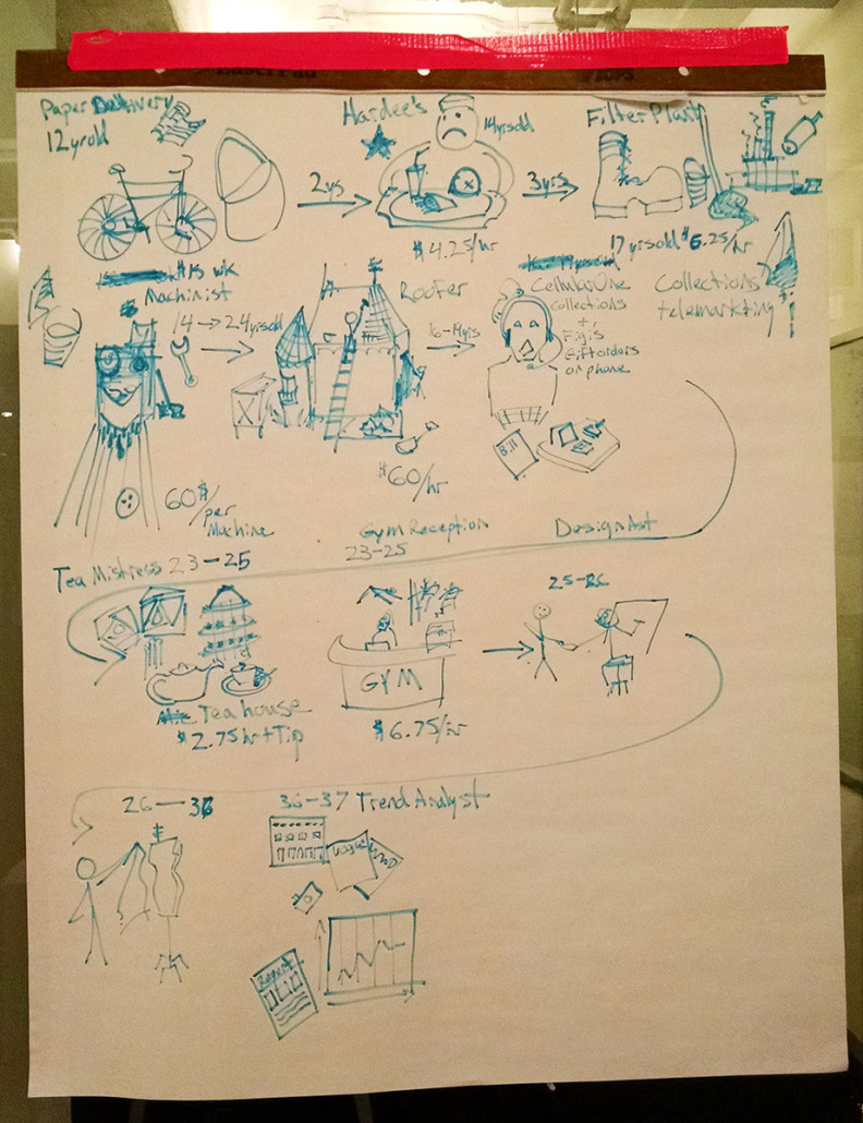
Then, we were to tell a story with a timeline and use text data with the images. I told the story of my career path, income and duration. I learned that with rich content and imagery, it is vital to plan the layout. John suggested I use color to separate information and to lead the eye. This exercise exposed what I need to work on in my presentations. I glean a lot of visual information in my weekly research; organizing it cohesively and then creating emphasis is my new focus.
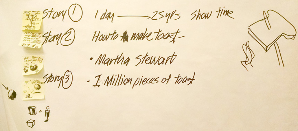
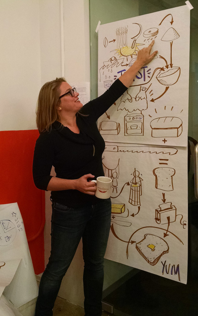
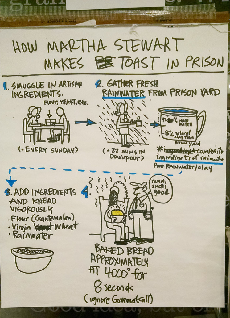
In this same exercise other members of the class chose to tell the story of Martha Stuart making toast. A variety of entertaining solutions came from this exercise.
I don’t think I’ve ever taken a workshop that gave me so much in so little time. It was a fun and engaging introduction into the practice of sketching quickly to communicate ideas. I came away with an awareness of my weaknesses and strengths as a visual communicator coming from an illustration background. I experienced a powerful group collaboration that exposed the mechanism of cooperating perspectives. I learned to simplify and plan but to value the unexpected and clever.
I highly recommend researching the Design Thinking process if you want to grow as a communicator and thought leader. If you’re in the New York City area, check out The Design Gym events, including once monthly happy hours as well as inexpensive crash courses that introduce you to some tools and mindsets of design thinking.
Here is a list of books I found helpful during my discovery in design thinking: “Experiences in Visual Thinking” by Robert M. Kim “Sketching User Experience: Getting the Design Right and the Right Design” by Bill Buxton “Sketching User Experience: The Workbook” by Bill Buxton ” Design Thinking” by Peter Rowe
Follow me on Goodreads for a full list of books that have made me a better designer.
